Book a Free Call
No commitment required

In the dynamic world of mobile applications, maps have transcended slender navigation tools, becoming essential interfaces that breathe life into digital experiences. From Ridesharing platforms to local discovery apps, geographic visualization provides context, interactivity, and spatial intelligence that connects users with their surrounding world.
Jetpack Compose has revolutionized how Android developers craft map experiences, offering intuitive tools to create sophisticated, customizable interfaces with remarkable ease. This post we will explore the art of designing custom map markers and dynamic info windows, transforming standard geographical representations into compelling, interactive narratives.
In a recent mobile scenario, we encountered a nuanced mapping challenge that pushed the boundaries of standard Google Maps implementation. The requirement was seemingly straightforward yet technically intricate: create a custom marker with an info window positioned dynamically to the left, accommodating variable-length text content. This seemingly simple design choice unveiled a complex interaction between marker positioning, info window rendering, and precise spatial calculations.
The core complexity emerged from the need to calculate anchor points and distances dynamically, ensuring that the info window elegantly coexisted with the marker without visual overlap or awkward positioning. Our solution would require a deep dive into Jetpack Compose’s mapping capabilities and a creative approach to handling dynamic content placement.
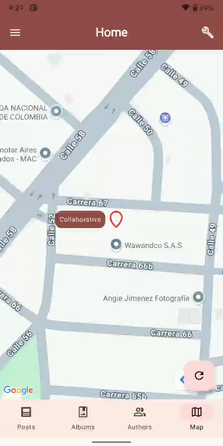
Let’s review the designs:

As we noticed, in the “Expected Design” image, the info window is placed to the left of the map marker, centered vertically, with a small gap between them. This contrasts with the “Default Design,” where the info window is placed directly on top of the map marker.
The desired design aims to create a more visually appealing and informative layout by separating the info window from the marker and positioning it in a way that avoids overlapping.
To implement this custom layout, you will likely need to leverage Jetpack Compose’s advanced mapping capabilities and perform custom calculations to determine the appropriate positioning of the info window relative to the marker. This may involve factors such as the length of the info window text, the screen size, and the overall density of elements on the map.
Alright, let’s break down the design process step by step, starting with the custom icon.
To use a custom drawable icon for the map marker, we first need to convert the icon into a bitmap resource. This is required by the marker composable in Jetpack Compose’s mapping functionality. We can use an extension function to handle this:
import android.graphics.Bitmap
import android.graphics.drawable.Drawable
import androidx.compose.ui.unit.IntSize
import com.google.android.gms.maps.model.BitmapDescriptor
import com.google.android.gms.maps.model.BitmapDescriptorFactory


fun Drawable.bitmapDescriptorFromVector(): Pair<BitmapDescriptor, IntSize> {
    // retrieve the actual drawable
    this.setBounds(0, 0, this.intrinsicWidth, this.intrinsicHeight)
    val bm = Bitmap.createBitmap(
        this.intrinsicWidth,
        this.intrinsicHeight,
        Bitmap.Config.ARGB_8888
    )

    // Draw it onto the bitmap
    val canvas = android.graphics.Canvas(bm)
    this.draw(canvas)

    // Return both BitmapDescriptor and its size (width, height)
    return BitmapDescriptorFactory.fromBitmap(bm) to IntSize(
        bm.width, bm.height
    )
}
Keep in mind that we are returning the IntSize unit with the Bit Map object. It’s going to be used later.
Now, we can start to build the full map composable:
@Composable
fun Map() {
    Box(
        modifier = Modifier
            .fillMaxSize()
            .background(MaterialTheme.colorScheme.background)
    ) {
        val wawandcoCoords = LatLng(11.00023065512785, -74.78773200436935)
        val cameraPositionState = rememberCameraPositionState()
        val markerState = rememberMarkerState(position = wawandcoCoords)
        val (markerIcon, markerSize) = ContextCompat.getDrawable(
            LocalContext.current, R.drawable.map_marker
        )
            ?.bitmapDescriptorFromVector()
            ?: (BitmapDescriptorFactory.defaultMarker() to IntSize.Zero)

        LaunchedEffect(key1 = wawandcoCoords) {
            cameraPositionState.centerOnLocation(wawandcoCoords)
        }

        GoogleMap(
            cameraPositionState = cameraPositionState,
            properties = MapProperties(isMyLocationEnabled = false),
            uiSettings = MapUiSettings(
                myLocationButtonEnabled = false,
                compassEnabled = false,
                zoomControlsEnabled = false,
            )
        ) {
            MarkerInfoWindow(
                state = markerState,
                icon = markerIcon,
            ) { marker ->
                Box(
                    modifier = Modifier
                        .background(
                            color = MaterialTheme.colorScheme.primary,
                            shape = RoundedCornerShape(12.dp)
                        )
                        .padding(8.dp)
                ) {
                    Text(
                        text = "Wawandco",
                        color = MaterialTheme.colorScheme.onPrimary,
                        style = MaterialTheme.typography.labelMedium,
                    )
                }
            }
        }
    }
}
Alright, let’s move on to the next step in the design process - adjusting the info window to be positioned next to the marker.
To accomplish this, we first need to determine the size of the UI element that contains the info window text. This will allow us to calculate the appropriate placement relative to the marker.
We can leverage the onGloballyPositioned modifier in Jetpack Compose to obtain the size information of the box that contains the info window text. By applying this modifier to the UI element that displays the info window content, we can retrieve its dimensions and use that data to position the info window correctly.
Let’s adjust the previous code:
MarkerInfoWindow(
    state = markerState,
    icon = markerIcon,
) { marker ->

    var markerString by remember { mutableStateOf("Wawandco") }

    // Mutable state for the info window size
    var infoWindowSize by remember mutableStateOf(IntSize.Zero) }

    Box(
        modifier = Modifier
            .onGloballyPositioned { coordinates ->
                infoWindowSize = coordinates.size
            }
            .background(
                color = MaterialTheme.colorScheme.primary,
                shape = RoundedCornerShape(12.dp)
            )
            .padding(8.dp)) {
        Text(
            text = markerString,
            color = MaterialTheme.colorScheme.onPrimary,
            style = MaterialTheme.typography.labelMedium,
        )
    }
}
When you apply
onGloballyPositionedto a composable, it will call a provided callback function once the element has been laid out and its dimensions are known. This callback receives aLayoutCoordinatesobject that provides information such as the element’s size (width and height), its position relative to the root of the layout, and even its offset within its parent container.
Once we have the size of the info window container, we can start to implement the logic for dynamically placing the info window to the left of the marker, ensuring it is vertically centered with a consistent gap between the two elements. This will require some careful calculations and adjustments to account for varying text lengths and screen sizes.
Let’s start calculating a standard spacing horizontally between the marker and the Info window, then calculate the anchor for each axis, considering the marker size and the Info window size:
val horizontalSeparation = with(LocalDensity.current) { 8.dp.toPx() }

// Adjust anchor based on the actual bitmap size
val anchorX = if (markerSize.width > 0) {
    -((infoWindowSize.width.toFloat() / 2) + horizontalSeparation) / markerSize.width.toFloat()
} else {
    0.5f
}

val anchorY = 1.0f
The
toPx()function helps us convert a Dp (density-independent pixel) value to a Float representing the equivalent number of physical pixels on the device’s screen.
Considerations:
1.0f, which places the info window at the bottom of the marker.0, the anchor x-axis is set to a value that aligns the center of the info window with the left edge of the marker, accounting for the horizontal separation. If the marker’s bitmap size is 0, the anchor x-axis is set to 0.5f, which will center the info window horizontally with the marker.Within the MarkerInfoWindow content block, you have access to the marker parameter, which represents the current map marker. This marker object provides the setInfoWindowAnchor method, which allows you to explicitly set the anchor position for the info window.
Earlier in the code, we calculated the appropriate anchor values based on the size of the info window and the marker’s bitmap. Now, we can apply these calculated anchor values to the marker object using the setInfoWindowAnchor method.
marker.setInfoWindowAnchor(anchorX, anchorY)
Excellent, now that we’ve walked through the individual steps and considerations for setting up the custom marker and info window layout, let’s take a look at the full code that incorporates all the adjustments we discussed:
@Composable
fun Map() {
    Box(
        modifier = Modifier
            .fillMaxSize()
            .background(MaterialTheme.colorScheme.background)
    ) {
        val wawandcoCoords = LatLng(11.00023065512785, -74.78773200436935)
        val cameraPositionState = rememberCameraPositionState()
        val markerState = rememberMarkerState(position = wawandcoCoords)
        val (markerIcon, markerSize) = ContextCompat.getDrawable(
            LocalContext.current,
            R.drawable.map_marker
        )?.bitmapDescriptorFromVector() ?: (BitmapDescriptorFactory.defaultMarker() to IntSize.Zero)

        LaunchedEffect(key1 = wawandcoCoords) {
            cameraPositionState.centerOnLocation(wawandcoCoords)
        }

        var markerString by remember { mutableStateOf("Wawandco") }

        GoogleMap(
            cameraPositionState = cameraPositionState,
            properties = MapProperties(isMyLocationEnabled = false),
            uiSettings = MapUiSettings(
                myLocationButtonEnabled = false,
                compassEnabled = false,
                zoomControlsEnabled = false,
            )
        ) {
            MarkerInfoWindow(
                state = markerState,
                icon = markerIcon,
            ) { marker ->
                // Mutable state for the info window size
                var infoWindowSize by remember { mutableStateOf(IntSize.Zero) }

                val horizontalSeparation = with(LocalDensity.current) { 8.dp.toPx() }

                // Adjust anchor based on the actual bitmap size
                val anchorX = if (markerSize.width > 0) {
                    -((infoWindowSize.width.toFloat() / 2) + horizontalSeparation) / markerSize.width.toFloat()
                } else {
                    0.5f
                }

                val anchorY = 1.0f

                marker.setInfoWindowAnchor(anchorX, anchorY)

                if (!marker.isInfoWindowShown) markerString = strings.random()

                Box(
                    modifier = Modifier
                        .onGloballyPositioned { coordinates ->
                            infoWindowSize = coordinates.size
                        }
                        .background(
                            color = MaterialTheme.colorScheme.primary,
                            shape = RoundedCornerShape(12.dp)
                        )
                        .padding(8.dp)
                ) {
                    Text(
                        text = markerString,
                        color = MaterialTheme.colorScheme.onPrimary,
                        style = MaterialTheme.typography.labelMedium,
                    )
                }
            }
        }
    }
}

val strings = listOf(
    //...
)
To ensure the solution works for varying text lengths, we added random names with different lengths for testing
The key to our successful implementation was a thoughtful and multifaceted approach. At the core, we leveraged the onGloballyPositioned modifier to capture the size of the info window’s UI element, allowing us to calculate the appropriate anchor points for the marker and achieve the desired dynamic positioning.
Complementing this, we emphasized the importance of working with device-independent Dp values and converting them to physical pixels using the toPx() function. This density-aware design approach ensured visual consistency across different screen resolutions, a critical consideration for building robust and responsive mobile experiences.
By combining these various techniques—from precise layout measurements to anchor positioning and density-aware UI design—we were able to create a custom map marker solution that met the requirements, demonstrating an adaptable and visually appealing approach to map interfaces in Android applications.
The insights gained can be applied more broadly to other UI challenges that require precise positioning and layout customization in Jetpack Compose. Understanding how to leverage modifiers, state management, and low-level mapping APIs can empower us to push the boundaries of what’s possible with Android’s mapping capabilities.