Book a Free Call
No commitment required
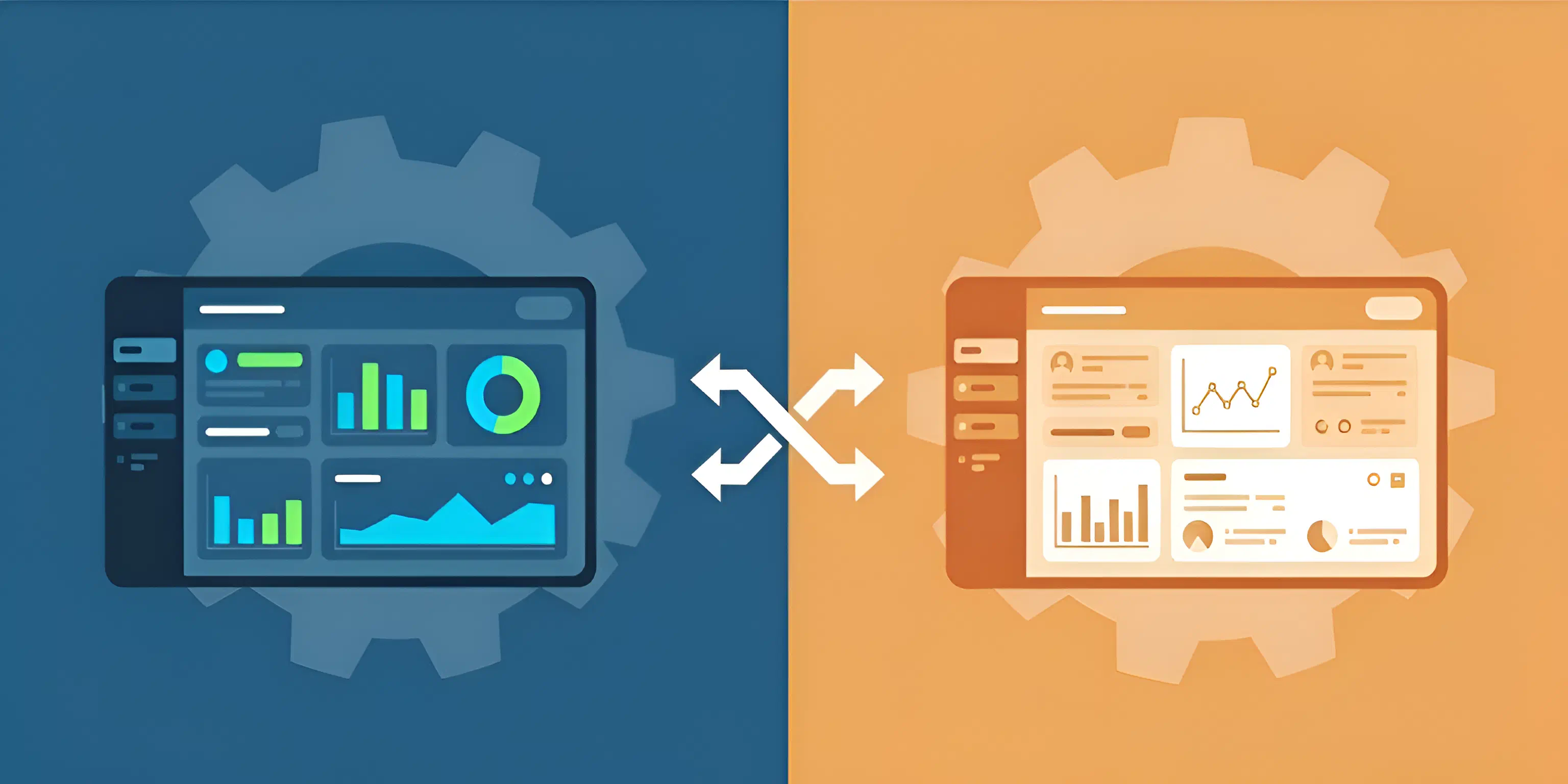
Designing user interfaces that elegantly support multiple themes—across admin and user dashboards, dark and light modes, or multi-tenant branding—has long been a painful slowdown for teams. Hours are lost untangling overrides and brittle config files, and the result is often technical debt that drags on innovation.
With Tailwind CSS v4, that changes. By bringing design tokens into native CSS variables, teams can finally simplify theme management in a way that is fast, resilient, and future-proof. More importantly, it frees developers from low-value complexity so they can focus on delivering value faster and scaling with confidence. In this post, we’ll explore what makes this approach so powerful, why true differentiation matters, and how to implement practical, scalable theme switching for real-world platforms.
From a design and UX perspective, differentiation is more than aesthetics:
As Smashing Magazine points out:
Administration experience is often assumed or glossed over in software because 99% of users never engage with it directly. Yet this is one critical area that, when used effectively, can tie closely to a company’s business strategy and affects the bottom line. [1]
This highlights why it’s worth designing admin-specific interfaces with the same level of care — not just reusing user-facing patterns, but tailoring them to the unique workflows and responsibilities of admins.
Theme management is rooted in the concept of design tokens: reusable values for colors, typography, spacing, etc. In Tailwind v4, @theme allows tokens to be defined as CSS variables, which utility classes then reference. This enables context-driven theming—different tokens can be scoped or swapped depending on the tenant, role, or mode active in the UI.
Tailwind v4 and its new CSS-first configuration approach simplifies theming by removing the old tailwind.config.js file. Instead, everything is defined in CSS through:
@theme → define tokens like colors, spacing, and typography.@layer → extend Tailwind’s base, components, and utilities layers.This shift makes multi-portal theming cleaner than ever.
Setup design tokens using @theme in your main CSS:
@import "tailwindcss";

@theme {
  --color-primary: hsl(220, 90%, 56%);
}
Utility classes like bg-primary or text-primary will now use these variables.
Now, configure scoped theme selectors per context (multi-tenant, admin/user):
@layer base {
  .admin-portal {
    --color-primary: #aab9ff;
  }

  .tenant-a {
    --color-primary: #56d0a0;
  }
}
This way, when the .admin or .tenant-a class is present on the body, the primary color changes accordingly. Now, each portal inherits from the base but changes its own look. This is powerful because you can add more portals just by defining new classes and variables.
And that’s it! 💅🏽 You can now use Tailwind utilities like bg-primary, text-primary, etc., and they will adapt based on the active portal class.
Lastly, apply the portal class to the root element in your HTML:
<!-- Admin Portal -->
<body class="admin-portal">
  <div class="bg-primary text-white p-4 rounded">Admin Header</div>
</body>

<!-- Tenant A -->
<body class="tenant-a">
  <div class="bg-primary text-white p-4 rounded">Tenant A Header</div>
</body>
✅ Changing the <body>’s class swaps the color palette everywhere those tokens are referenced.

This system lets you support thousands of tenants or theme variants without duplicating CSS or managing brittle override logic. Adding a new context is as simple as defining a new scoped theme—no monolithic config rewrites needed. Tokens can be extended to cover typography, shadows, borders, breakpoints, and more, ensuring consistency and maintainability at scale.
In a bigger application, you might have something like this:
@import "tailwindcss";

@theme {
  /* Default (fallback) tokens */
  --color-primary: hsl(220, 90%, 56%);
  --color-secondary: hsl(260, 70%, 50%);
  --font-sans: 'Inter', sans-serif;
  --breakpoint-md: 768px;
}

@layer base {
  /* Tenant: AcmeCorp */
  .tenant-acmecorp {
    --color-primary: #0284c7;
    --color-secondary: #0ea5e9;
    --font-sans: 'Roboto', sans-serif;
    --shadow-sm: 0 2px 4px rgba(2, 132, 199, 0.2);
    --breakpoint-md: 820px;
  }

  /* Tenant: NovaHealth */
  .tenant-novahealth {
    --color-primary: #22c55e;
    --color-secondary: #84cc16;
    --font-sans: 'Helvetica Neue', sans-serif;
    --shadow-sm: 0 2px 6px rgba(34, 197, 94, 0.2);
    --breakpoint-md: 780px;
  }

  /* Tenant: SkyLogix */
  .tenant-skylogix {
    --color-primary: #6366f1;
    --color-secondary: #3b82f6;
    --font-sans: 'Segoe UI', sans-serif;
    --shadow-sm: 0 3px 8px rgba(99, 102, 241, 0.25);
    --breakpoint-md: 900px;
  }
}
As you can see, each tenant has its own set of design tokens defined under a unique class. This allows for easy scalability and customization without the need for complex configurations or multiple CSS files.
🚀 If you’d like to see this approach in action, we’ve prepared a simple Dashboard Example that applies these theming techniques in a real layout. Check it out here: Dashboard Example Repo on GitHub.
It’s a lightweight starting point you can clone, run, and extend — whether you want to explore multi-tenant branding or role-based dashboards.
Let me tell you why this is so powerful:
This approach can be extended further:
.dark class to toggle dark mode styles in case you don’t want to use the dark: tailwind variant.Here is a quick example of adding dark mode:
@import "tailwindcss";

@custom-variant dark (&:where(.dark, .dark *));
<body class="dark">
  <div class="bg-white dark:bg-black">
    <!-- ... -->
  </div>
</body>
Then toggle the .dark class on the body to switch themes.
Combining CSS variables and the @theme directive in Tailwind CSS v4 enables clean, scalable theme management for complex platforms. This approach centralizes design tokens, leverages native CSS, and adapts instantly to new contexts or tenants. If your architecture needs flexible theming—from admin panels to multi-tenant SaaS—this technique is modern, maintainable, and ready for years of growth.
Beyond the mechanics, Tailwind v4 also suggests something bigger: clarity tends to scale better than complexity. When the foundation is lightweight and adaptable, teams move faster and aim higher, spending less time wrestling with the system and more time exploring what comes next.