Book a Free Call
No commitment required

When building web applications, one of the most important characteristic of user experience is how users perceive performance. Even the fastest backend and frontend systems can seem slow and frustrating if users are staring at a white screen while waiting for content to load. Skeleton screen is a design technique where placeholders shaped like actual content are displayed during loading, giving users a visual preview of the page’s layout and reducing the perception of wait times.
In this post, we’ll explore how to build skeleton screens using Go and HTMX for backend and dynamic client-side interactions, combined with Tailwind CSS for styling. By the end, we’ll understand not only how to implement a skeleton screens but also its benefits, potential downsides, and why it’s a great addition to your developer toolkit.
Skeleton screen is a user interface (UI) design technique used to improve loading times and perceived performance in our applications. The purpose of this technique is to give users a visual clue that the content is loading while maintaining a sense of continuity in the user interface. Using a skeleton screen provides a more engaging and less frustrating loading experience. [1]
Skeleton screens have several advantages that make them a popular choice for modern web applications:
Skeleton screens improve perceived performance by replacing traditional loading indicators with placeholders that mimic the structure of the final content. This approach creates a smoother visual experience, as users see a representation of the layout immediately, reducing frustration during loading times.
Here’s what makes skeleton screens effective:
1. Contextual Feedback: Unlike generic spinners or progress bars, Skeleton screens provide a sense of what the user is waiting for. This is especially useful in content-heavy applications like blogs, e-commerce sites, or dashboards.
2. Smooth Transition to Real Content: When the real data loads, it often matches the shape and layout of the placeholders. This reduces visual jarring and creates a more seamless user experience.
3. Enhanced User Engagement: By keeping users visually occupied with placeholders, skeleton screens can reduce bounce rates and improve engagement metrics, especially for slower-loading applications.
Poor loading times can negatively impact your website or app in several ways. They can increase your website’s return rates; many users will simply click away and go to a competitor’s site, leading to a significant loss of potential customers or visitors. [2]
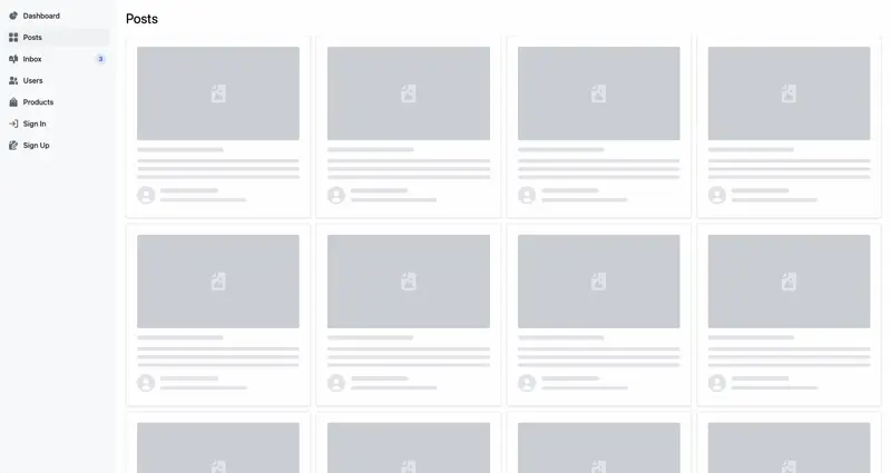
As demonstration, we’ll build a dashboard using a skeleton screen. The dashboard will display a list of posts, and use placeholders while the content is being fetched. To build this, we will use:
So let’s do it!
As mentioned above, we’ll use Leapkit to facilitate the creation of a Go and HTMX Web application. While it’s not mandatory, it significantly helps reduce development time and effort.
$ go install github.com/leapkit/leapkit/kit@latest
$ kit new skeleton-dashboard
The Leapkit CLI simplifies setting up a Go project, providing all the necessary tools to get our web app up and running.
We’ll start by creating a single Go handler that will show the skeleton of our list of posts. In this handler, we won’t load the posts yet, but display a skeleton screen instead.
// internal/posts/index.go

// Renders the skeleton posts page
func Index(w http.ResponseWriter, r *http.Request) {
	rw := render.FromCtx(r.Context())

	err := rw.Render("posts/index.html")
	if err != nil {
		server.Errorf(w, http.StatusInternalServerError, "error rendering template: %s", err.Error())
	}
}
This handler will render the posts/index.html template, which will contain the skeleton screen layout. Now, let’s create the posts/index.html template.
<!-- internal/posts/index.html -->

<h2 class="text-3xl mb-5">Posts</h2>

<div class="grid grid-cols-4 gap-3">
    <%= for (v) in between(0,12) { %>
        <div class="p-4 h-96 border border-gray-200 rounded shadow animate-pulse">
            <div class="flex items-center justify-center h-52 mb-4 bg-gray-300 rounded">
                <svg class="w-10 h-10 text-gray-200" fill="currentColor" viewBox="0 0 16 20">
                    <path d="..." />
                    <path d="..."/>
                </svg>
            </div>
            <div class="h-2.5 bg-gray-200 rounded-full w-48 mb-4"></div>
            <div class="h-2 bg-gray-200 rounded-full mb-2.5"></div>
            <div class="h-2 bg-gray-200 rounded-full mb-2.5"></div>
            <div class="h-2 bg-gray-200 rounded-full"></div>
            <div class="flex items-center mt-4">
            <svg class="w-10 h-10 me-3 text-gray-200" fill="currentColor" viewBox="0 0 20 20">
                    <path d="..."/>
                </svg>
                <div>
                    <div class="h-2.5 bg-gray-200 rounded-full w-32 mb-3"></div>
                    <div class="w-48 h-2 bg-gray-200 rounded-full"></div>
                </div>
            </div>
        </div>
    <% } %>
</div>
This template contains a simple skeleton screen layout with placeholders for the post title, description, and author information. The placeholders are styled using Tailwind CSS classes to create a clean design.
The
dattribute in the<path>tag is a placeholder for the SVG icon. You can replace it with any SVG path data to customize the icon. Thebetween(0,12)function is a helper that generates a range of numbers from 0 to 12. It is used to create multiple placeholders for the skeleton screen. This function is included in the Leapkit template, which uses Plush as its templating engine.
At this point our skeleton screen is ready. Let’s run the application to see the skeleton screen in action.
$ go run ./cmd/app
Navigate to http://localhost:3000 in the browser to see the skeleton screen. We should see the placeholders for the posts while the content is loading.

Now that we have the skeleton screen in place, let’s create the LoadPosts action that will load the actual posts and render them.
// internal/posts/index.go

// Renders the skeleton posts page
func Index(w http.ResponseWriter, r *http.Request) {
	// ...
}

// Renders the posts list
func LoadPosts(w http.ResponseWriter, r *http.Request) {
	rw := render.FromCtx(r.Context())

	rw.Set("posts", AllPosts)

	err := rw.RenderClean("posts/posts.html")
	if err != nil {
		server.Errorf(w, http.StatusInternalServerError, "error rendering posts template: %s", err.Error())
	}
}
In this action, we load the AllPosts data and render the posts/posts.html template. This template will display the actual posts instead of the skeleton screen.
AllPosts is a slice of Post struct that contains the post data. We can replace it with any other data source.
// post.go

type Post struct {
	FileName       string
	Title               string
	Description    string
	AuthorEmail   string
	AuthorName   string
	AuthorRole     string
}

var (
	AllPosts = []Post{
		{
			FileName:        "image-0.webp",
			Title:                "How to Build a Skeleton screen",
			Description:     "A comprehensive guide to creating a Skeleton screen with modern tools.",
			AuthorEmail:    "jane.doe@example.com",
			AuthorName:    "Jane Doe",
			AuthorRole:      "Frontend Developer",
		},
		{
			FileName:        "image-1.webp",
			Title:                "Mastering Go for Backend Dev",
			Description:     "Learn advanced Go techniques for building high-performance backends.",
			AuthorEmail:    "john.smith@example.com",
			AuthorName:    "John Smith",
			AuthorRole:      "Backend Engineer",
		},
        // ...
    }
If you noticed, the LoadPosts action renders the posts/posts.html template and passes the list of posts in the context as posts. Let’s create the posts/posts.html template to display the actual posts.
<!-- internal/posts/posts.html -->

<%= for (index, post) in posts { %>
    <div class="p-4 h-96 border border-gray-200 rounded shadow">
        <div class="flex items-center justify-center mb-3">
            <img class="w-full h-52 rounded" src="/public/images/<%= post.FileName %>">
        </div>

        <h3 class="mb-2 font-semibold"><%= post.Title %></h3>
        <p class="text-sm text-gray-600"><%= post.Description %></p>

        <div class="flex items-center mt-4">
            <svg class="w-10 h-10 me-3 text-gray-200" fill="currentColor" viewBox="0 0 20 20">
                <path d="..."/>
            </svg>
            <div>
                <div class=" font-semibold"><%= post.AuthorName %></div>
                <div class="text-gray-600"><%= post.AuthorRole %></div>
            </div>
        </div>
    </div>
<% } %>
This template uses the posts data passed from the LoadPosts action to render the list of posts. Each post is displayed with its title, description, author name, and role. The posts are styled using Tailwind CSS classes to create a clean and responsive layout.
Now that we have the skeleton screen and actual posts in place, let’s add HTMX to make the content dynamic. HTMX allows us to update the content without reloading the page, providing a smoother user experience.
Let’s update our posts/index.html template to add the HTMX attributes.
<!-- internal/posts/index.html -->

<h2 class="text-3xl mb-5">Posts</h2>

<div class="grid grid-cols-4 gap-3" hx-get="/posts" hx-trigger="load" hx-swap="innerHTML">
    <%= for (v) in between(0,12) { %>
        <div class="p-4 h-96 border border-gray-200 rounded shadow animate-pulse">
            <div class="flex items-center justify-center h-52 mb-4 bg-gray-300 rounded">
                <svg class="w-10 h-10 text-gray-200" fill="currentColor" viewBox="0 0 16 20">
                    <path d="..." />
                    <path d="..."/>
                </svg>
            </div>
            <div class="h-2.5 bg-gray-200 rounded-full w-48 mb-4"></div>
            <div class="h-2 bg-gray-200 rounded-full mb-2.5"></div>
            <div class="h-2 bg-gray-200 rounded-full mb-2.5"></div>
            <div class="h-2 bg-gray-200 rounded-full"></div>
            <div class="flex items-center mt-4">
            <svg class="w-10 h-10 me-3 text-gray-200" fill="currentColor" viewBox="0 0 20 20">
                    <path d="..."/>
                </svg>
                <div>
                    <div class="h-2.5 bg-gray-200 rounded-full w-32 mb-3"></div>
                    <div class="w-48 h-2 bg-gray-200 rounded-full"></div>
                </div>
            </div>
        </div>
    <% } %>
</div>
We added three HTMX attributes to fetch the actual posts from the /posts endpoint and replace the skeleton screen with the loaded content. Here’s what each attribute does:
We use the innerHTML value to replace the content of the container with the new posts. This should allow us to load the actual posts when the page is loaded.
HTMX 2.0is already included in the Leapkit template, so we don’t need to install it separately.
Now that we have implemented the skeleton screen and dynamic content loading, let’s run the application again and see the new changes.
$ go run ./cmd/app
Navigate to http://localhost:3000 in the browser to see the skeleton screen in action. We should see the placeholders for the posts while the content is loading. Once the posts are loaded, the placeholders will be replaced with the actual post data.
We added a sidebar navigation to make our dashboard look as a real dashboard.
And that’s all. 🎉
We have successfully implemented a skeleton screen with Go and HTMX. Users will now see a skeleton screen while the posts are loading, providing a more engaging and less frustrating experience. You can check out the full code on GitHub Skeleton Screens with Go, HTMX, and Tailwind CSS. 🚀
While skeleton screens can improve the user experience of web applications, there are some considerations to keep in mind:
Complexity: Implementing skeleton screens can add complexity to the design and development process. It requires additional effort to create and maintain the placeholders, especially for dynamic content.
Potential for Overuse: Overusing skeleton screens on every element can be distracting and may not align well with the overall design.
Performance Impact: While skeleton screens can improve perceived performance, they may not always speed up the actual loading time. If the data takes too long to load, users may still experience delays.
Despite these considerations, skeleton screens are a valuable design technique that can enhance the user experience of web applications. By providing visual feedback during loading times, skeleton screens can reduce frustration and improve engagement.
Skeleton screens are a powerful design technique that can improve the perceived performance and user experience of web applications. By using placeholders shaped like actual content, users can see a visual preview of the page’s layout while the data is loading. This reduces the perception of wait times and creates a more engaging loading experience.
In this guide, we explored how to build a skeleton screen using Go for the backend and HTMX for dynamic client-side interactions. We created a dashboard that displays a list of posts with a skeleton screen layout. We used Tailwind CSS to style the placeholders and HTMX to load the actual posts without reloading the page. This technique will help you create a smoother and more engaging experience for your users.