Book a Free Call
No commitment required
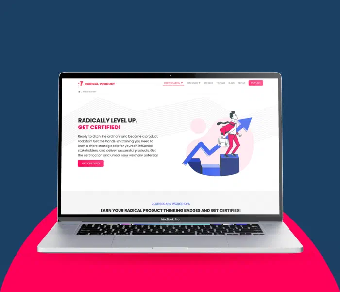
When we first connected with the Radical Product Thinking team, their website already showcased a powerful methodology for building vision-driven products. However, its presentation online didn’t do it justice. The content felt scattered, and navigation wasn’t as intuitive as it could be. For a framework built to provide clarity, the site itself needed more of it.
The challenge was clear: reorganize the content so users could easily grasp the methodology and make navigation seamsless—from the toolkits to workshops and talks.
We rolled up our sleeves and started prototyping. Mid-fidelity layouts gave us the freedom to experiment with different structures without overthinking the visuals at first. From there, we refined how content should flow, what should be highlighted, and transformed the website into an accessible guide instead of a confusing maze. To bring it all together, we combined Jekyll for static content and Ruby on Rails for dynamic functionality, creating a flexible foundation that balanced speed, maintainability, and a smooth user experience.
The new Radical Product Thinking website became cleaner, sharper, and easier to navigate. Users could now jump straight to the toolkit, sign up for a workshop, or browse talks without feeling lost. Most importantly, the methodology now claims center stage, presented in a visually appealing and accessible way that matches its impact. Looking back, this project wasn’t just about navigation or layout—it was about creating a digital home that truly reflects the Radical Product Thinking vision: simple, structured, and inspiring for organizations ready to make their mark.
If you’re interested in improving your website design or learning more about our design services, please feel free to reach out to us. Let’s make it happen!